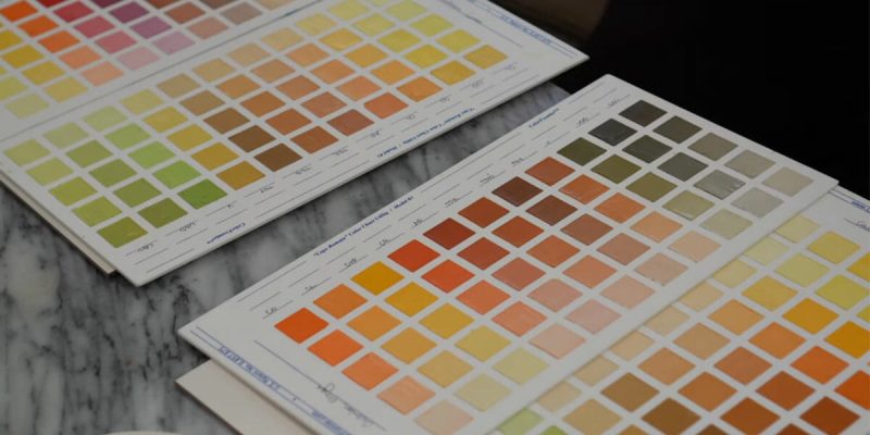
Many beginning oil painters realize that color mixing can be strangely unpredictable.
Even if you know a bit about color theory, things are complicated by each pigment’s unique nature and strength.
The best way to save yourself from paintings that disappoint due to weak color mixes, chalkiness, or lack of harmony, is to learn your palette inside and out!
Below, you find out the nuances of each paint color and how to make your own color charts, so you can master color and learn to predict its every move.
Contents
Why Should You Make an Oil Color Chart?
You should make a color chart with your oil paint because getting well acquainted with the colors on your palette will instantly make you a more confident painter.
Instead of stumbling through making unfamiliar colors while working on a painting, and ultimately getting frustrated (we’ve all been there), learn by making your own individualized color charts first.
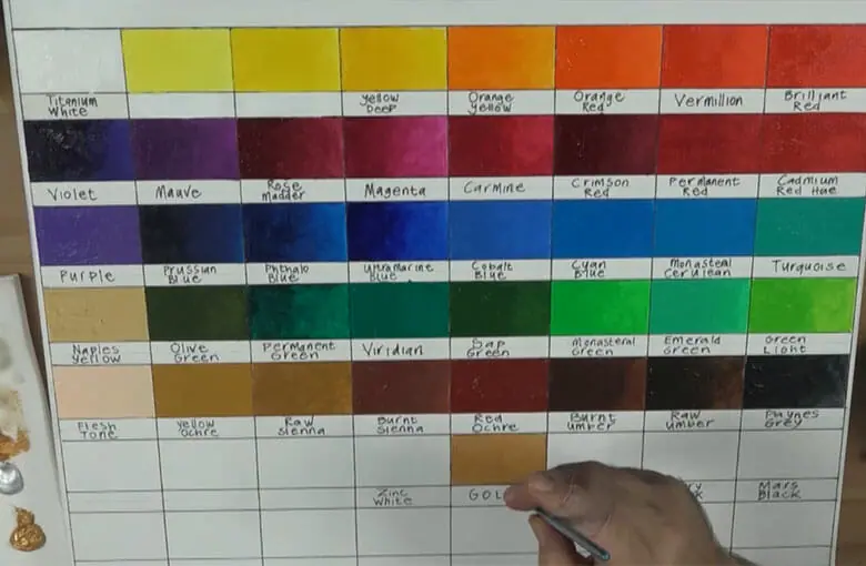
This way, you can focus solely on the color with no other distractions.
Taking the time to carefully and thoughtfully make oil color charts to study your oil paints will give you command over what’s possible for each pigment and its many combinations in any circumstance.
And If you’re just starting your oil painting journey, Evolve Artist offers a free Oil Painting for Beginners mini course. They’ll share some helpful exercises and guide you through greyscale value studies.
This will help you learn more about your oil paint and how to mix it before jumping into painting color!
What You Need to Know About Your Colors
Colors have numerous traits that can clue you into how they’ll behave as you mix them.
When studying a color, ask yourself:
- Is this pigment relatively light or dark? This is a color’s “value”, which will determine how light or dark your final mixtures become. Recognizing it is one step to take to get to the right colors. Learn more about what is value in art and how to use it.
- Is this pigment relatively warm or cool? A color’s temperature also determines the temperature of its complement! For example, red and green are complements, but a warm red will specifically have a cool green complement. This is because warm reds lean toward orange and cool greens lean toward blue. Still confused? Watch this video below.
- Is this pigment transparent or opaque? The behavior and possibilities of each pigment are not always predictable based on how they appear from the tube. Transparent colors, as well as blues and purples, tend to appear much darker and more difficult to judge once they’re thinned or tinted with white.
- How strong or intense is the pigment? All pigments have varying intensity. This greatly affects the ratio of colors needed as you mix.
You can carefully read about these qualities when buying your pigments, but seeing them in action and mixing them yourself is the best way to commit them to memory and learn the nuances of each paint.
It’ll also be helpful to get to know some artist color terminology before we get started.
- Hues are pure colors/pigments, like yellow, orange, red, blue, etc.
- Tints are mixtures of a pigment with white. (Think pastel colors!)
- Tones are mixtures of a pigment with gray. (See the third circle from the outside in the chart below.)
- Shades are mixtures of a pigment with black. (See the innermost circle with the darkest colors.)
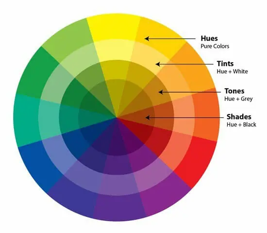
Read on to find out the traits of each hue in the color wheel and how this translates to paint.
Yellow Paint Colors
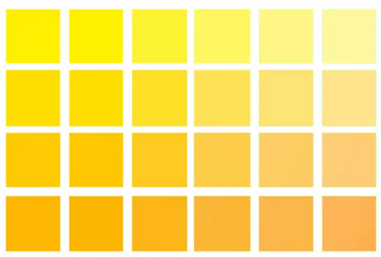
Yellow, one of the primary colors, is a hue often on the lighter side of the value range.
Cooler yellows, like Daniel Smith’s Lemon Yellow and Cadmium Yellow Light Hue lean toward being more greenish as they move toward that side of the color wheel. This results in their complement being a slightly warmer or more reddish violet.
Warmer yellows like Daniel Smith’s Cadmium Yellow Medium Hue and Gamblin’s Cadmium Yellow Deep lean closer to orange than their lighter counterpart, so they have a cooler, more blue-violet complement.

Cadmiums are opaque and are known for the quality of their tinting strength, but yellow itself is not one of the most intense pigments on a palette.
Gamblin’s India Yellow, a transparent yellow great for glazing, appears from the tube as a deep orange-y pigment. But it makes an opaque, buttery yellow when tinted with white.
Orange Paint Colors
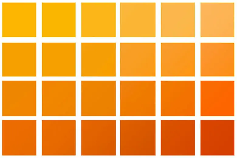
Orange is the next lightest on the value scale. While you can mix beautiful oranges with a combination of various yellow and red paints, there are also great, pure orange pigments from the tube-like cadmium orange.
Cadmium orange is bright, opaque, and highly saturated. Secondary colors like cadmium orange can be helpful to have on your palette to cut down on your mixing time. (All of Gamblin’s cadmium are formulated to be less toxic, too!)
Brands like Winsor & Newton have alternatives called “Cadmium Free” paints, and Daniel Smith has “Cadmium Hue” options like Cadmium Orange Hue. Note that these approximate the colors, but may have lower tinting strength than traditional cadmium pigment.
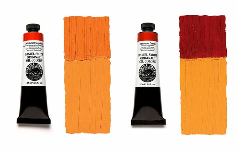
Blue is orange’s complement, but the type of blue depends on how cool or warm the orange is (or how far it leans toward yellow or red on the color wheel).
For a more transparent orange, try Daniel Smith’s Transparent Orange or Gamblin’s Transparent Orange and Permanent Orange, which are both suitable for glazing.
Red Paint Colors
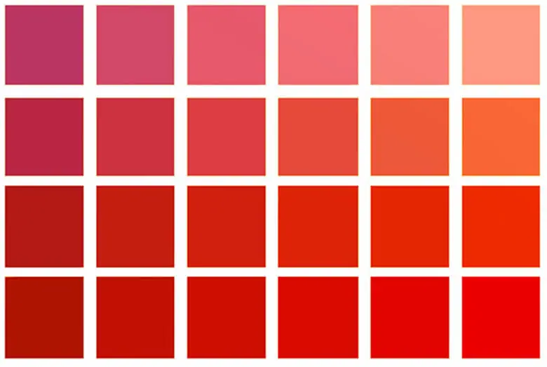
Red, another primary, tends to be toward a middle-value range.
Gamblin’s Cadmium Red Light is a very warm red that is closer to orange, so you’ll notice that it’s not ideal for making violets/purples.
You’ll achieve something closer to a brown if you mix it with a little blue, or even a deep chromatic black if the mixture has more blue in it.
These colors might not be the perfect purple that you’d expect based on the color theory in art we learn as kids, but they are extremely useful mixtures for paintings in almost any subject in oil. So consider them a plus, rather than a failure!
And just be sure to have a cooler red on your palette as well if you want to mix more recognizable purples.
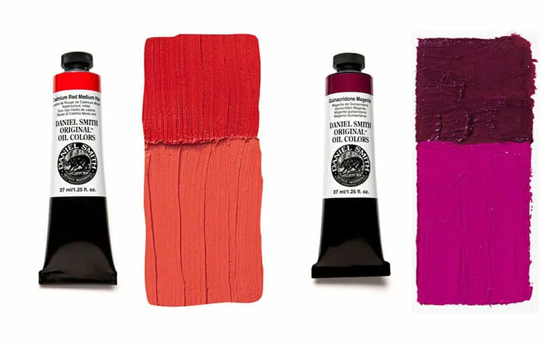
Gamblin’s Cadmium Red Medium moves closer to a true red. And their Alizarin Crimson and Quinacridone Magenta (my favorite paint color!) get progressively cooler and cooler.
Purple Paint Colors

With purple, we move past light hues and start getting into the darker value range from the tube.
This means you might be unable to tell exactly how warm or cool a pigment is until you tint it with some white or try to add it to another color mixture.
One of the warmest purples available is a red-violet called Quinacridone Violet. This pigment varies between paint brands. Gamblin’s appears redder than Daniel Smith’s which is a bit cooler and more saturated.
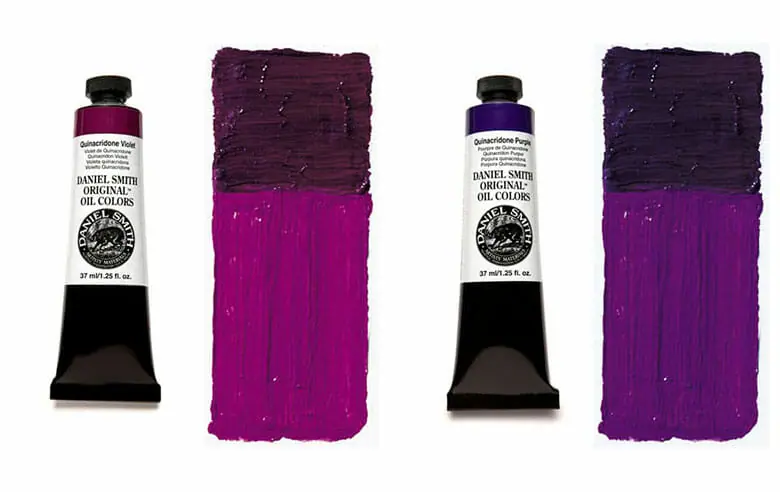
Some cooler violets include Daniel Smith’s Quinacridone Purple and Ultramarine Violet.
Interestingly, all of these purples are transparent to varying degrees.
Blue Paint Colors
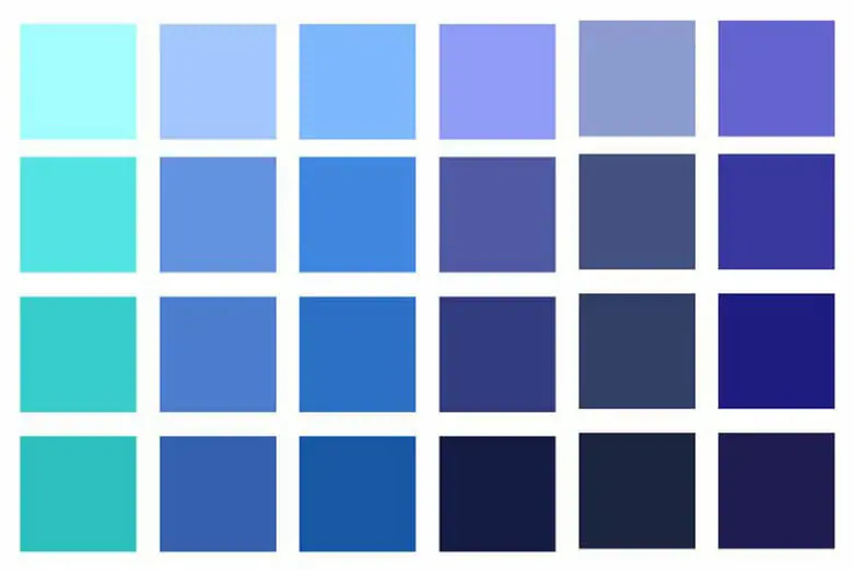
Blue, the last of the primary colors, tends to be in the darker value range out of the tube, but there are some exceptions!
For some artists, it can be tricky to determine whether a blue is warm or cool, since they are all on the cool side of the color wheel.
The easiest way to tell is to remember that the cooler the blue is, the closer it will lean toward green shades. The warmer it is, the closer it will move toward violet.
Daniel Smith’s Ultramarine blue deep is on the warmer side with semi-transparency.
Cobalt Blue vs. Prussian Blue
Gamblin describes their Cobalt Blue as a “true blue.” It’s light in value (especially compared to prussian blue) when it comes out of the tube and more neutral in temperature than the other blues available.
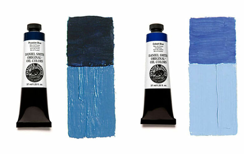
Cooler, darker blues include prussian blue and phthalo blues. These appear almost black from the tube. These cool blues are very strong pigments with high tinting strength, so a little goes a long way.
Green Paint Colors

Green is another pigment that tends to be dark from the tube, but has exceptions as well.
Exemplifying the lighter value greens are the very warm, opaque Cadmium Green or
Cadmium Green Hue pigment and semi-transparent Permanent Green Light.
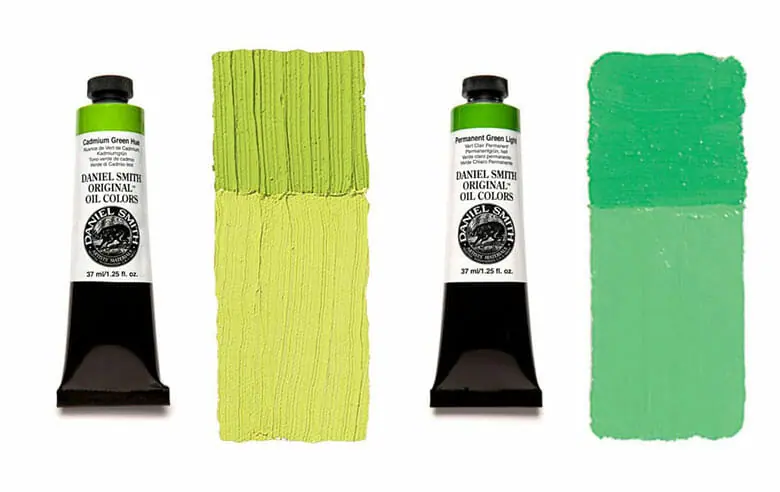
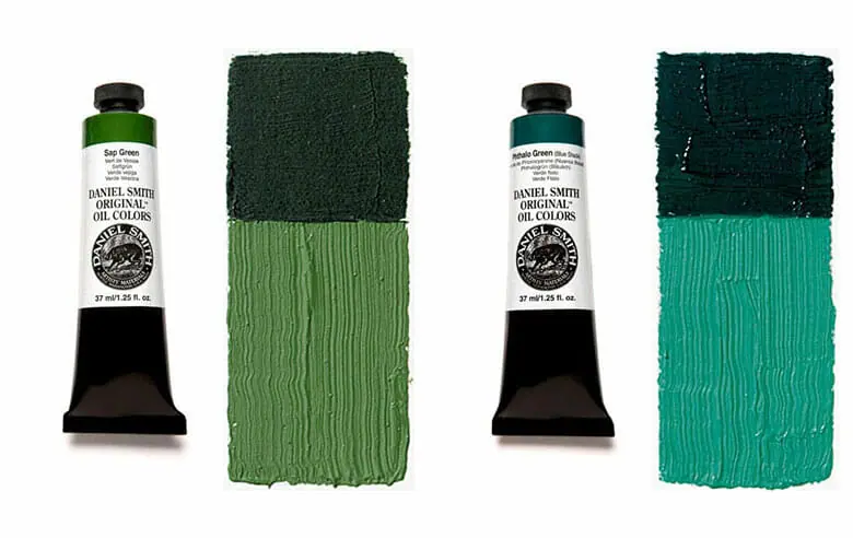
For the cooler greens, we move toward transparency with Viridian and even cooler and darker with Phthalo green, which leans significantly toward blue.
There are also a variety of more muted greens from the tube that look more like they can be seen in nature. These are useful for earthy landscape oil painting, like transparent Sap Green and Chromium Oxide Green, with greater opacity.
Earth Tone Paint Colors
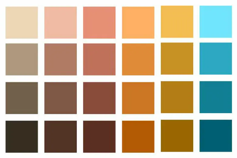
Earth tones are a range of mineral pigments that are made up of deep yellows, reds, and browns of varying levels of warmth and coolness.
These colors have a history as favorites of the Old Masters for their availability at the time and light fastness. You can spot them throughout the art history of oil painting.
They are easily recognizable as earth pigment by their similarity in color to naturally occurring clays, soils, and types of minerals like iron oxide.
Earth tones vary in transparency between transparent, semi-transparent, and opaque colors. They are extremely useful for underpainting, thin washes, landscape paintings, and flesh tones.
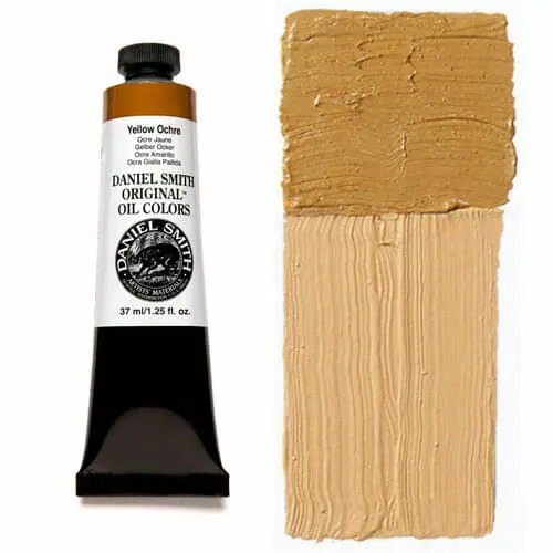
Yellow ochre is recognizable on the palettes of many artists. It’s a deep, gold-like yellow that is convenient to have, so you don’t have to start from bright, crisp yellows and tone them down so frequently.
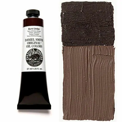
Semi-transparent and warm, Burnt Umber is a staple on many palettes for its usefulness in mixing. Mixed with ultramarine or prussian blue, it makes beautiful chromatic black shades. Its counterpart, raw umber, is cooler.
Raw and Burnt Siennas are used frequently by artists in underpaintings as well.
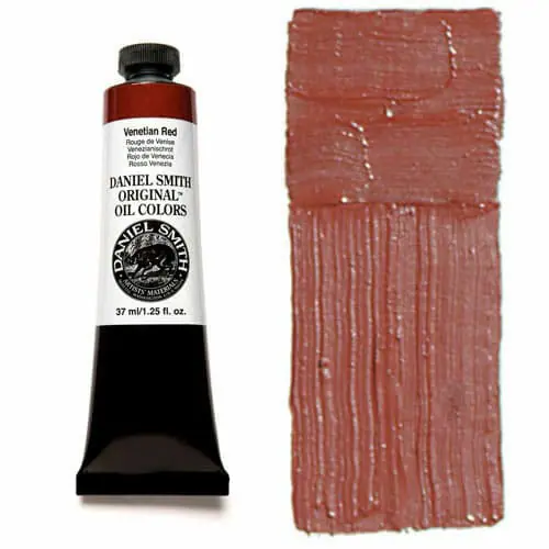
Venetian Red is a strongly pigmented, opaque example of an earth tone, while Transparent Earth Red is a dark version of the pigment with greater transparency, so it’s suitable for rich glazing.
Black, White, and Gray Paint Colors

Black, white, and gray may seem simple at first, but they are just as complex as any other colors on your palette.
They vary in temperature, value, and level of transparency as well.

In limited palettes, like the Zorn color palette, Ivory black is relatively cool enough that it can even serve as a blue and be used to mix with yellow to create muted greens.
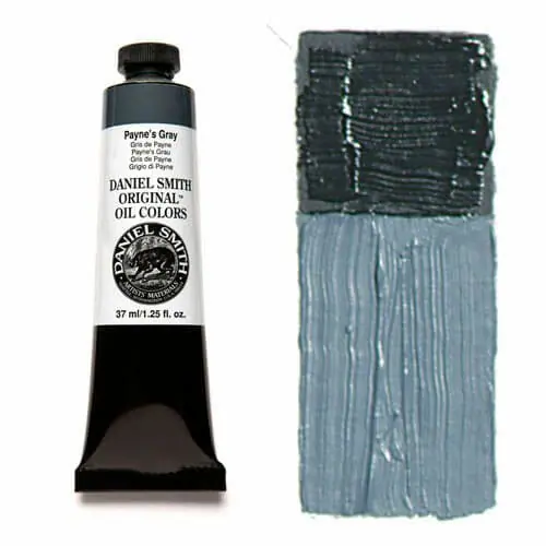
As for grey, the dark and cool Payne’s Grey can serve as a black from the tube or be tinted to be much lighter. Lighter grays from the tube include Gamblin’s various Portland Greys.
Titanium white is one of the most commonly used white paints in oil painting.
It’s bright and has a strong opacity, but its opacity means that when using it to mix colors, it can easily make mixtures appear too chalky.
This can quickly reduce the color quality of oil paintings.
Zinc white, on the other hand, is a transparent white that is uses full for glazing and scumbling. However, it is a weaker paint.
That’s where Gamblin’s Titanium-Zinc White comes in. It’s a perfect combination of the great qualities of both whites, without the drawbacks of either. (Switching to titanium-zinc white helped my oil painting improve so much!)
Color Chart Exercises To Increase Your Confidence and Accelerate Your Painting Career
Color chart exercises will allow you to wield color however you see fit.
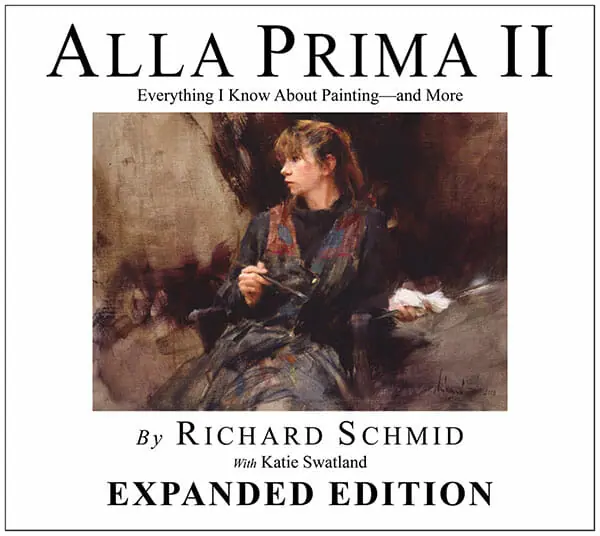
In his book, Alla Prima II, Richard Schmid goes over color in oil painting in tremendous depth.
He provides color chart exercises and study methods for artists that give you the tools to make sense of whatever palette you choose to use.
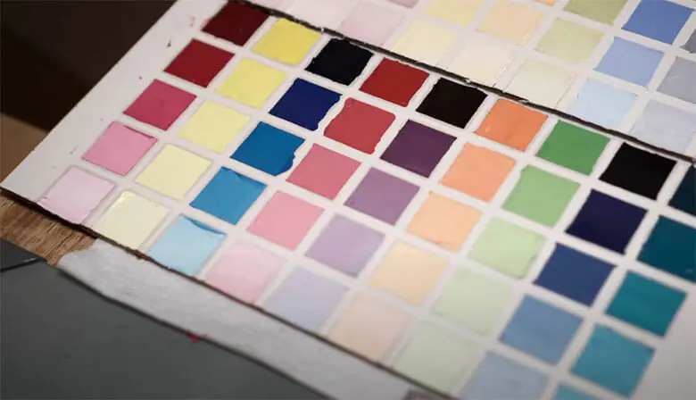
The exercises require a deep dive into each pigment you have by requiring you to mix full value ranges of the tints (base color + white at different percentages). Then you must mix each base color with the next.
This will show you the array and quality of colors possible from your palette. It also allows you to see the gaps in what you can mix with your current colors.
Richard Schmid is a master artist and colorist. His color charts, or variations, are used as a teaching tool in classical art studies and oil painting classes worldwide. You can find Alla Prima II here to study and learn from yourself.
Below, we’ll go over how to make your own chart, specific to your palette, but first, we’ll talk about some ways they can be tailored to which oil paints you’re personally curious about.
How To Approach Making Personalized Color Charts
Artist Chelsea Long gives an excellent example in her video, “The Only Oil Painting Colors You Need”, of the kind of personalized exploration that you can do with this type of exercise.
In her video, she tests and makes charts for three separate 3-color palettes, each with different attributes and uses.
They range from a muted earthy palette to a typical primary palette, to a more saturated “CMYK” style adaptation with cool primaries rather than warm ones (genius connection!).
When making your chart, feel free to add as many different colors as you’d like to use. You can make any amount of charts necessary.
These exercises are time-consuming, but the goal is not to complete them quickly. Work slowly and intentionally and pay close attention to each mix.
You’re not looking for perfection necessarily, like when making a work of art. The act of making the chart is even more important than the end result.
You’re working to build skill and an oil painting practice, so think of it like this: you’re working on you as an oil painter, rather than on a single painting project. This is art training, just like any athlete who first jogs so they can later run.
What Are the Most Important Oil Paint Colors?
The most important oil paint colors depend on your goals, but to have a full range of colors to mix, you’ll want to have at least a warm and cool version of red, yellow, and blue, as well as a white.
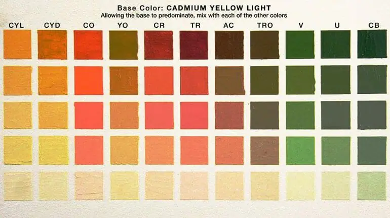
You can use any warm and cool pigments you like, but an example of a basic oil painting palette like this would include:
- lemon yellow or cadmium yellow light (cool yellow)
- cadmium yellow deep (warm yellow)
- cadmium red light (warm red)
- quinacridone magenta (cool red)
- ultramarine (warm blue)
- prussian blue (cool blue)
- and titanium-zinc white.
Charting a palette consisting of a warm and cool red, a warm and cool yellow, a warm and cool blue, and white, will give you a vast range of colors to work with and the ability to mix almost any of the colors you’re missing.
You can get away without having black paint or any of the earth colors (you can mix a color similar to yellow ochre by knocking cad yellow down with violet!). Still, they can be very useful, and many artists love working with them.
No matter what colors you have, whether a small handful or a huge collection, the practice of making oil color charts is meant to familiarize yourself with your specific palette.
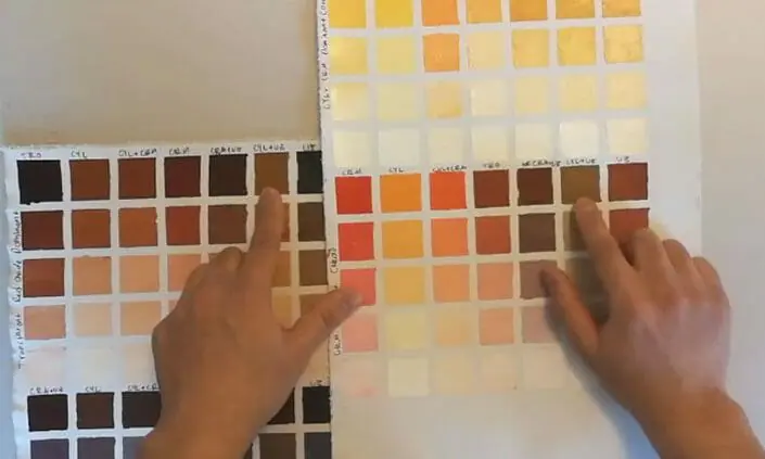
So whichever colors you use, from whichever paint brands, you’ll learn about them in-depth and be able to take full advantage of their mixing properties.
Step 1: Mapping Out Your Chart
Once you know how many base colors you’d like to make swatches for, you can start to make your grids.
For example, if you use 6 colors + white (like the warm/cool primary palette mentioned above), you will need to have a grid of 6 squares across and 5 squares down.
The materials you’ll need are:
- A surface to work on. You can use canvas paper, a primed board, a wooden panel, or any other oil painting surface.
- A pencil to label your colors
- ¼ inch Painters tape. Mask off your grid to make painting your swatches a lot easier and faster. Tape will give you nice, sharp edges.
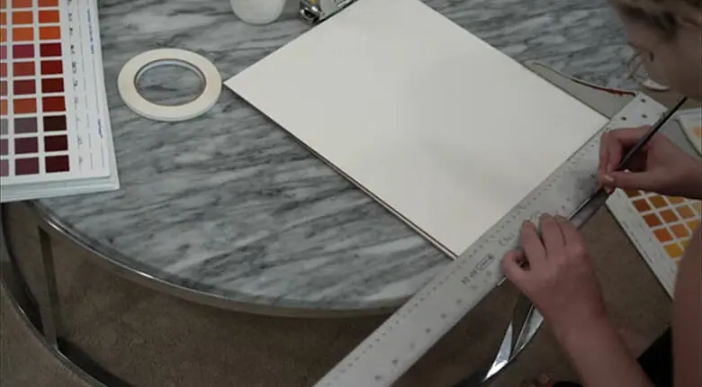
Make your squares equal in size, and equally distant, so you’ll be looking at the same surface area of each color once they are laid down.
The uniformity of the chart, in both color and non-color space, will ensure that you can learn the most effectively without anything being skewed.
If you don’t have tape, use a ruler to make even squares for your swatches.
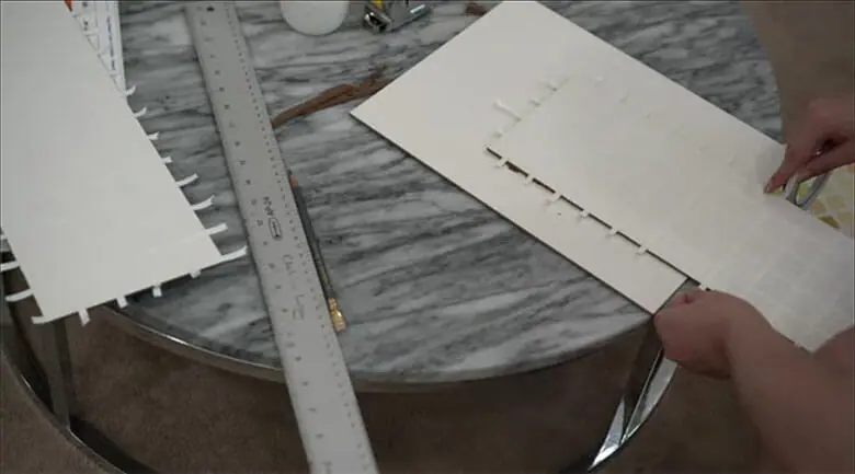
You will need one grid for your base colors + white.
And then, you will need to make a grid for each individual base color mixed with all of the other base colors, + white.
So with 6 base colors, you’ll make 7 charts total.
Step 2: Planning and Mixing
Whether you use Richard Schmid’s system of organizing your chart or come up with your own, make sure you are consistent and note down what each mix represents.
Base Color Value Chart:
To follow this exercise, plan to paint each pigment straight from the tube in the top row of swatches. These will represent each pigment in its purest form, at full strength.
You’ll notice that any darker pigments, like blues and purples, will be hard to gauge in this row because they appear nearly black. That’s okay! The tints below will help you see their potential uses.
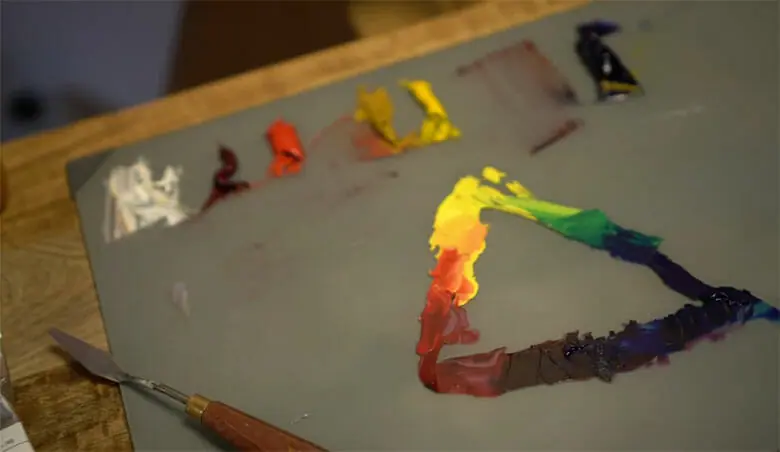
Each of the rows below will consist of each base color mixed with increasing amounts of white.
Every pigment has a different strength, becoming very noticeable as you work. For example, Phthalo pigments are so strong that they may only require a tiny dot added in to your white!
So rather than trying to stick to an exact formula or recipe for how much white to mix, think of it as charting each color at 75% power, 50% power, 25% power, and then finally, the lightest amount of color that you can mix with white.
This last row will help you learn to mix subtle highlights because highlights are rarely pure white from the tube!
You will use a different amount of white for each color, so you will have to experiment to find the best solutions.
This trial and error experimentation is where the exercise starts to really make a difference.
Additional Color Mixing Charts
Next, you’ll be making a chart that represents each individual base color as the dominant color mixed with all of the others, one at a time.

For a chart with Cadmium Red as the dominant color, plan to mix it with each base color for the top row, making sure that the ratio of Cadmium Red is higher than that of each of the other colors, and label it as such.
Below, you’ll place the tinted values for each mixed color, so make sure you make enough of each one to combine with white four times!
Step 3: Paint Your Swatches
Now, you can carefully paint your charts!

- Make sure to fully cover your swatches using a brush or palette knife. You don’t want much variation in coverage or for white to show through.
If there is too much inconsistent texture, it can also cause shadows and skew your view of the colors, so shoot for an even application. - Don’t be afraid to mix, paint, remix, or repaint, if a color doesn’t seem quite right. It’s okay to paint over them. There’s no wasting during this learning process!
If you paint over it, make sure that the color does not blend with what was laid down previously if it is still wet.

- You must also make sure that you are using the same color for each of the value mixtures.
So if you repaint the top row color at any point, you will need to repaint each of the tinted values below them to represent it accurately.
(I’ve worked with students who have tried to pass the tints from other mixtures off as tints of a different color; trust me, it’s noticeable! Taking the extra time will be a huge favor to your future self.)
Step 4: Study What You’ve Painted!
Time to step back and take in the above information!
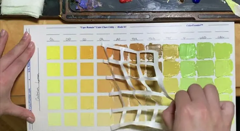
With your finished color chart in front of you, you can see a whole world of possibilities that your chosen palette has to offer.
- Besides the benefit of seeing tons of individual mixtures, you’ll also be able to see how the colors interact next to each other. You can see how harmonious or dissonant certain colors become in different contexts.
- And context is everything when it comes to color. Each color exists relative to the next. A pigment that you think of as warm could appear entirely cool next to an even warmer color.
- In the right context, you can make yellow read as green. Or a mid-tone blue as a white, depending on what colors surround it.
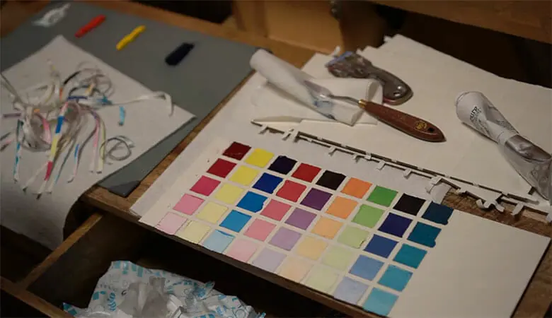
For a comprehensive breakdown of the theory of how colors work with, against, and around each other, read Josef Albers’ “Interaction of Color”! This is another wonderful book studied by artists everywhere.
(This book uses cut paper, rather than oil, but the lessons are extremely valuable and apply to painting.)
This will give you the power to create oil paintings with colors that project specific moods and atmospheres.
Besides the visual reminder and reference your chart provides, you also have the muscle memory of mixing and know the feel of how each oil color works with the next. This is an invaluable practice.
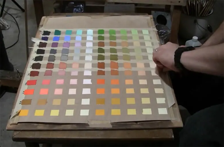
Now that you’ve established oil painting practices that will move you forward, the more you work with color, the more will become available to you as a painter.
What Else Can You Learn About Oil Painting From a Color Chart?
You’ll likely be surprised by what occurs with some of the mixtures!
- The color charts will help you discover unexpected possibilities in between what you expect to happen.
- Most people wouldn’t predict that black and yellow can make a green, for example. Or that cadmium red and prussian blue combined are one of many options to mix your own black.
- This exercise can teach you how to predict exactly what will happen when you mix your oil colors, so you’ll be able to perfectly color match anything when painting from observation.
- It will give you a greater understanding of how to work with any other oil colors that you try later on too. You’ll be an expert at noting temperature, value, transparency, and other technical information.
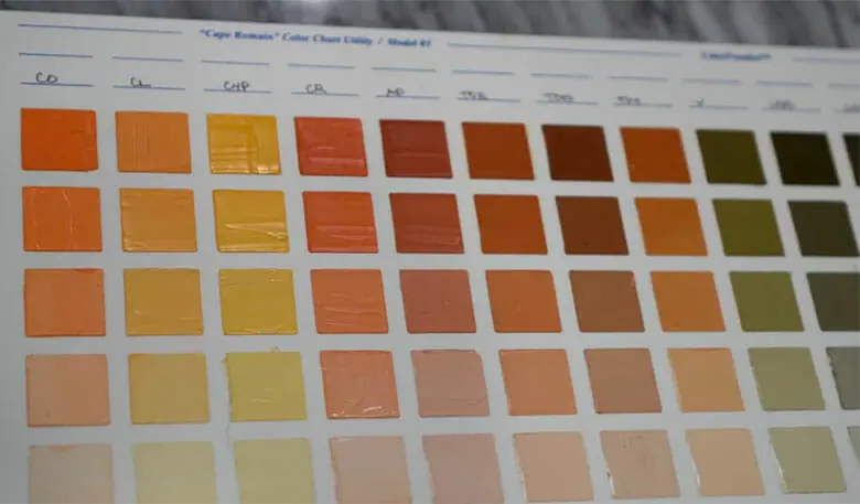
- The goal isn’t to memorize every set of mixtures of every oil pigment but to instill the basic methods of getting the color you need, every time.
You’ll build up some muscle memory for mixing and be able to be confident that you know your way around your materials.
Essentially, you’ll be in the driver’s seat, rather than at the whim of your oil paints.
And if you ever do get lost along the way, your oil color charts will serve as helpful roadmaps to lead you to the perfect mixtures. - You’ll waste less time and paint fumbling when you have a handy reference at your disposal.
How To Mix The Perfect Color Ratio
Learning the relative strength of the oil colors you’re combining is the key to controlling what you mix and finding the ratios to achieve the perfect colors with the least hassle.
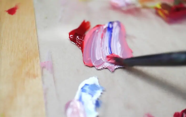
There are two helpful techniques to consider each time you work with your colors.
- Start with a larger amount of the weaker of the two oil colors and slowly add small amounts of the stronger color until it shifts enough to what you are looking for.
It is always easier to add more of a strong color than trying to shift back to the weaker one! - Start with a larger amount of the oil color that is closest to the color you want to achieve.
This will save you paint by taking the shortest, most direct path.
Use your discretion regarding which practice to follow. Sometimes the answer is one or the other, and sometimes both will come into play!
Don’t Be Afraid To Start Again
It is also helpful to recognize when certain mixtures have gone too far in one direction to be worth trying to wrangle into what you originally wanted them to be.
Sometimes it’s best to scoop what you mixed up with your palette knife and put it to the side (it could be useful for something else!) and start again.

There’s no shame in trying a second time to get the ratio just so.
This can save you from piling more and more paint into a color mix you won’t end up using right away.
As you learn more about your colors, these mishaps will become a rarer and rarer occurrence.
Your color chart will teach you how to get comfortable with the strength and ratio of each pigment needed.
You won’t have to struggle going back and forth trying to make a pigment lighter or darker, brighter or duller, warmer or cooler, again and again. It’ll become an intuitive process.
Lightfastness
And finally, you can see how each oil pigment behaves as it dries.
- This gives you a look at how fast each pigment dries and if your white paint will yellow eventually.
- You can also observe, over time, the difference between lightfast pigments and those that will one day fade.
- Note also which colors dry matte and which are more glossy.
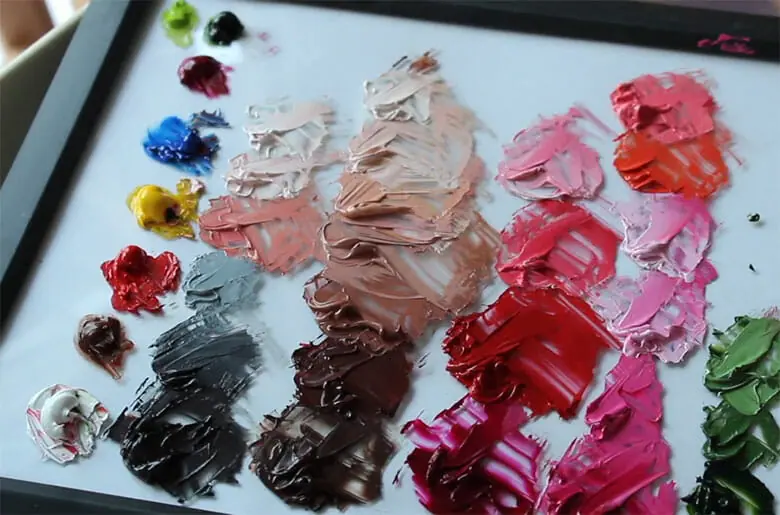
All of these elements together will guide you in making oil paintings that will last.
It can be hard to discern what each color is doing when all the colors are pushed around and blurred together in a painting, but with clear-cut squares of pigment, you can see perfectly what’s going on.
What’s Next?
You can find more color lessons, exercises, and inspiration in your own copy of Alla Prima II by Richard Schmid.
And let us know what you think about it in the comments!
Feel free to share this article with other artists who might want to learn about working more intentionally with color in their oil paintings.
Happy painting!


