The complexity of color can be difficult for beginners and even experienced artists to grasp. Color temperature breaks down the color wheel into easier working parts.
While color temperature is a little scientific, its application is more straightforward than you may realize. If you already have a grasp on warm colors vs cool colors, you’re on the right track.
Many artists shy away from this concept, but I’ll show you why it’s worth your time. Below I’ll explore color temperature, why it matters, and how to apply this approach to your next painting.
Contents
- What is Color Temperature?
- Tips for Understanding How Color Temperature Works in Paintings
- Tip #1: Color Temperature is Highly Relative
- Tip #2: Color Temperature Can Create the Illusion of Perspective
- Tip #3: Color Temperature Can Change the Hues of the Same Color Family
- Tip #4: Color Temperature Can Make a Subject Appear Bright or Dull
- Tip #5: Color Temperature Can Make a Space Feel ‘Bigger’
- Color Temperature is a Subtle Touch That Transforms a Painting
What is Color Temperature?
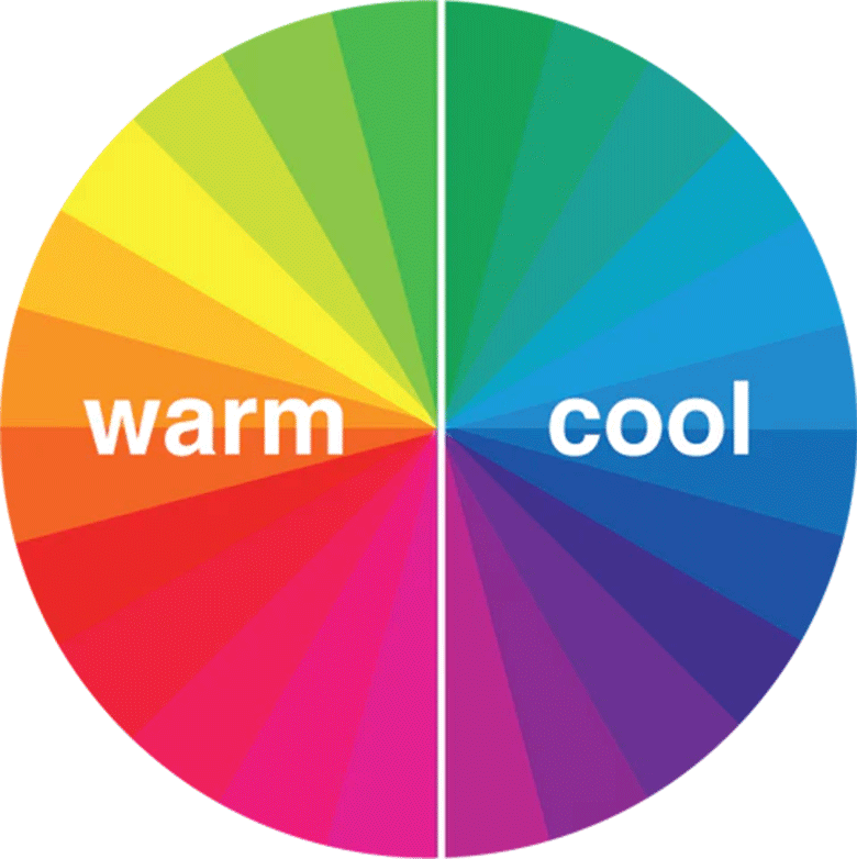
Color temperature, at its most simple, describes the warmth or coolness of a color. One of the easiest ways of categorizing color is through the standard color wheel.
Color wheels come with primary, secondary, and tertiary colors. Each color group has warm and cool variations that we translate into everyday life. Think about the last time you saw a color and felt a particular sensation – a vivid orange tree or a gray-blue lake. Why do some colors make you feel colder and others warm?

Color temperature is a fantastic way to get the creative juices flowing. Not only are you selecting a color palette for your painting, but you’re also ascribing deeper sensation and meaning. For example, you could create a warm sunset with peach and gold colors to inspire joy or excitement.
To contrast, you could create a cool sunset with lavender and periwinkle to create a more serene and relaxed mood.
What are the Three Variations of Color Temperature?
You can further divide color temperature of light into three versions – warm white, cool white, and daylight white. Interestingly enough, these are common settings found in lightbulbs and cameras.

Warm white is exactly what it says on the tin – it has an ambient yellow glow that ‘feels’ warm. Cool white is the opposite, more washed out and mimicking fluorescent light. Lastly, daylight white mimics the outdoors.
Tips for Understanding How Color Temperature Works in Paintings
Over time, your ability to understand color temperature contrast in your painting will be second nature. My tips below will help you speed this process along.
Tip #1: Color Temperature is Highly Relative
Color temperature is relative – the same color will look different depending on what it’s next to. For example, a rosy pink looks warmer next to a dark blue than a bright yellow.
Let’s take a look at some of Claude Monet’s work to see how a single color can feel different depending on the surrounding temperature contrasts.

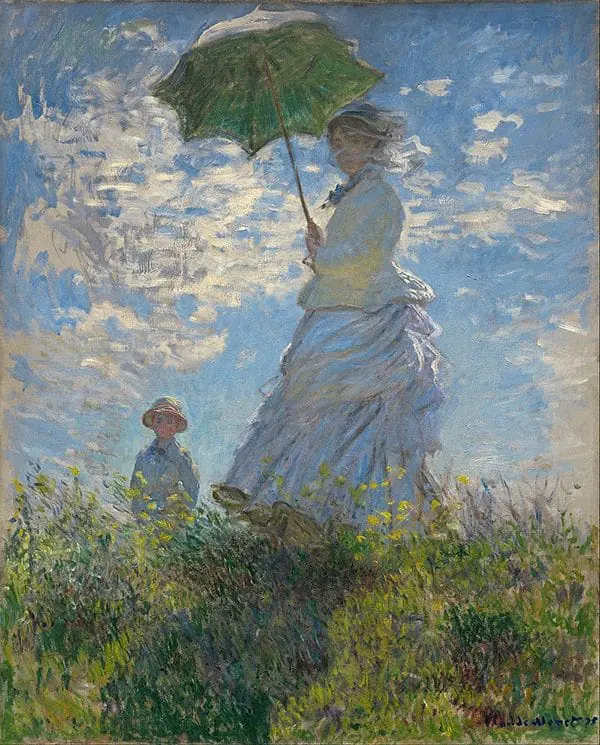
His famed painting ‘Woman With a Parasol’ uses a cool blue as its dominant color. However, this painting still manages to feel warm and sunny. This apparent paradox lies in two main details – the brightness of the blue and the contrast with the other colors.
The blue’s brightness creates a liveliness that would be missing from a darker shade, making it ‘feel’ warmer. Likewise, the white clouds and white outfits are even more washed out than the blue. Since the sky is more saturated, it feels more alive.
While the green grass provides a warmer color contrast, it’s still technically a cool color. This addition keeps the contrast between the green and blue from being too stark, thus reducing the chilling effect the blue could’ve had.
To make this point clearer, let’s look at another Claude Monet painting that uses blue in heavy amounts.

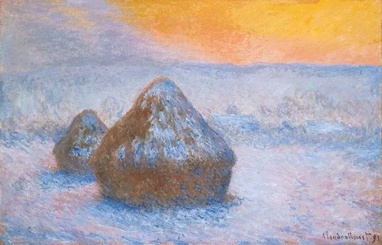
‘Stacks of Wheat (Sunset, Snow Effect)’ by Claude Monet also uses a lot of blue, but this illustration feels much colder. While the blue is quite pale and bright, the warmest color is more dramatic.
Notice how the vivid orange pops against the washed-out blues and purples. Unlike green, which is also on the cool spectrum, orange is a strictly warm color. Any time it’s placed next to a shade like ultramarine blue or violet, it’s going to jump out at the viewer.
Color temperature is incredibly helpful for creating what’s known as color harmony. This concept refers to the artist’s ability to capture moods and sensations with certain color combinations.
You can learn more about how colors interact with each other with Joseph Albers’ book Interaction Of Color. This book is a staple of art schools around the world and provides a clear explanation of how to make sense of color temperature.
Tip #2: Color Temperature Can Create the Illusion of Perspective
Color temperature is a powerful tool able to capture emotion and even create the illusion of perspective. Atmospheric perspective refers to how a subject will become less saturated as it recedes from the viewer.

‘The Prodigal Son’ by Frank Brangwyn is a top-notch example of how color temperature can create the illusion of space. Despite the painter using similarly thick and rough brushstrokes throughout the painting, there’s still a sense of distance.
Notice how the figures in the back are not just smaller, but more washed out. Their neutral colors are a stark contrast against the central subject’s warm and saturated hues.

‘The Swing’ by Jean-Honoré Fragonard is another fantastic representation of this effect. One of the painting’s greatest strengths is how effectively its color temperature communicates a sense of space.
From the cool green in the shadow areas to the warm light, the eye enjoys incredible balance all across the board. However, notice how the colors further up the painting become more bright and washed out. Not only is the light cooler, but the lighter tint suggests atmosphere – maybe even a haze of mist.
The ultramarine blue in the shadows also stimulates depth through the richness of color.
Tip #3: Color Temperature Can Change the Hues of the Same Color Family
Here’s a fascinating tip: the same color can still have different levels of warm or coolness. This concept can be tricky to grasp at first, but once you see it, you can’t unsee it.
For example, oil painters may be familiar with cadmium yellow light vs cadmium lemon. The former is a little warmer, while the latter has the faintest cool tinge. These differences are pretty subtle, so they tend to stand out more depending on color relation.

Vincent Van Gogh’s ‘Still Life with Apples, Pears, Lemons, and Grapes’ leans hard toward the warm end of yellow’s spectrum. Saturated yellows dominate the entire piece, from the vivid bright yellow to the orange-yellow hatching.
Even his choice of cool colors lean toward the warmer side, such as the warm blue hatching and rich green.

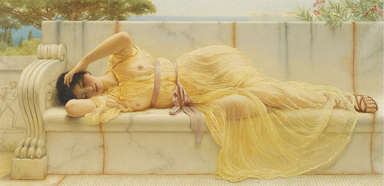
Let’s contrast Van Gogh’s painting with this gorgeous neoclassicist painting by John William Godward. The yellow focal point here feels much cooler for several reasons.
The most notable is the color relation. While the Van Gogh painting kept the entire piece as warm as possible, this illustration washes everything out with pale beige and faded greens. As a result, the yellow doesn’t pop out as intensely.
Now, the yellow hue still doesn’t feel quite as cool as the skyline’s blue strip. It’s still a generally warm color. Nonetheless, you can see the differences in a single color depending on its placement between warm and cool elements.
You don’t have to memorize everything – there are handy color charts that help you organize your colors quickly.
Tip #4: Color Temperature Can Make a Subject Appear Bright or Dull
Color temperature creates contrast in a subject by varying intensity. As you’ve seen in the first few tips, this intensity level creates the illusion of perspective or harmonizes colors.
Saturation vs desaturation are essential terms to learn when painting. A saturated color is an intense one – think of a ripe cherry or a lush ocean wave. A desaturated color lacks intensity, feeling more washed out and pale – you may think of a gray sky or old, dry wood.
Knowing when to use the same temperature and when to shake it up can be tricky, so let’s look at an example.

‘Judith and the Head of Holofernes’ by Gustav Klimt showcases the power of both bright and dull colors in the same piece. The subject’s skin is a medley of faded blues, pale pinks, and almost grayed-out creams.
However, the local color of the gold and blue adds a pop of intensity that balances everything back out. These varying warm or cool temperatures encourage the eye to roam all around the piece.
I highly recommend Gustav Klimt’s work when learning how to mix colors. He had a firm grasp of when to blend blues and yellows and when to let them stand out on their own.
Tip #5: Color Temperature Can Make a Space Feel ‘Bigger’
The last tip on this list is another highly sensory detail to consider when you start painting. Color temperature makes a space feel bigger or smaller, a fact that people have extensively studied in psychology.
Interior design blends art and psychology to create spaces that resonate with people. You see this in everything from which furniture people prefer to the lighting styles.
Interestingly enough, the human eye has a way of perceiving different arm colors push forward and cool colors pull back in a painting.

Mary Cassatt was a master at using color temperature to push a painting toward or away from the viewer. ‘The Tea’ uses a warm red for the table to make the viewer feel as if they’re sitting with the two subjects.
Note the softer blue and cool red in the background – this strategic choice has the effect of pulling back from the viewer. The coolest color is the pale blue and gray-white in the right of the painting, balancing out the bolder hues.
The Psychology of Color Temperature
From warm colors in your bedroom to a cool color in the bathroom, color temperature depends on psychology. People have dedicated entire fields of study to the effect the color wheel has on our mood.
Color’s impact on our psychological state has been utilized in interior design, therapeutic paintings, and even treating post-traumatic stress in nurses.
Before we wrap up, it’s worth emphasizing the differences between color theory, color symbolism, and color temperature. The primary differences are:
- Color theory refers to our relationship with colors on an emotional and scientific level
- Color symbolism refers to the cultural and historical interpretations of color
- Color temperature refers to the warmth or coolness of a color
Color Temperature is a Subtle Touch That Transforms a Painting
Color temperature is how you transform a painting from solid to spellbinding. A simple shift in a warm red or cool blue can completely change how your viewer feels.
If you want more inspiration on how to utilize warm or cool colors, consider online art courses. Evolve Artist provides fundamental mini-courses that help you understand value, depth, and more.
Featured Image: Source


